MENU
Close





Maximilian Raynor SS27 plays out like a very British grudge match dressed in sunshine, wit and just enough disorder to keep the score unclear.
Maximilian Raynor SS27 plays out like a very British grudge match dressed in sunshine, wit and just enough disorder to keep the score unclear.
September 18, 2026
Advertisement

Advertisement



A brass band, two rival camps and a village green are hardly the usual ingredients for a fashion feud, but Maximilian Raynor has little interest in playing a straight game. Titled The Gingers vs. The Elders, his Spring 2027 collection turns British eccentricity into something close to sporting theatre, complete with the kind of rivalry that sounds serious until the clothes start having far too much fun with it.
The village green gives Raynor the perfect stage for a very British kind of chaos. Everything begins with manners, ceremony and a hint of competition, then slowly slips sideways into wit, eccentricity and visual tension. Nothing quite breaks character, but very little behaves exactly as expected.
The game may be imaginary. The clothes commit completely.
A grid usually promises order. Raynor seems far more interested in what happens after someone disturbs it.
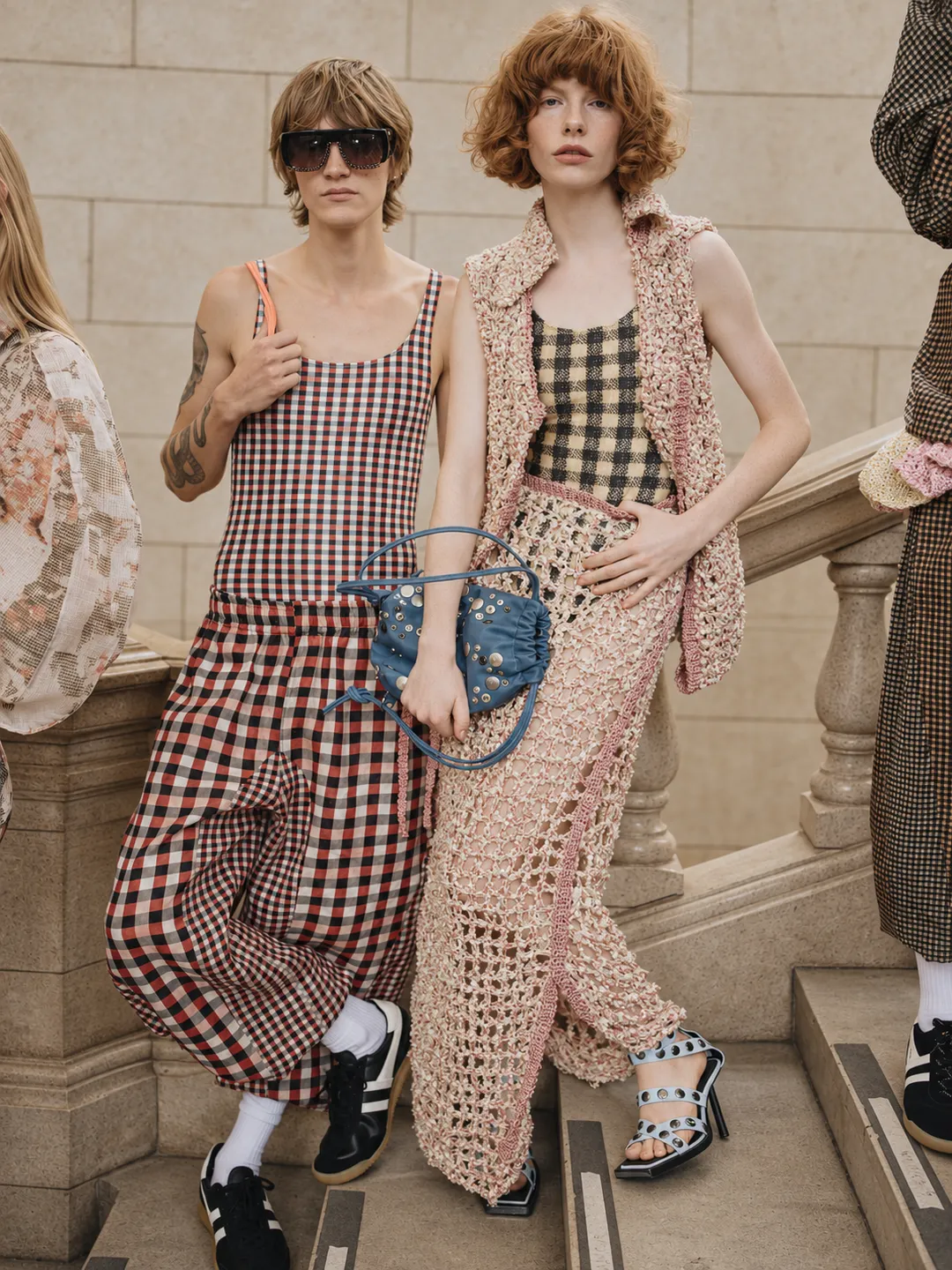
Checks appear throughout the collection as a recurring visual language, sometimes neatly aligned across familiar shirt and tailoring shapes, then warped by gathering, proportion and the movement of the body. A square can remain perfectly legible on one garment and become almost abstract on another, stretched around curves or interrupted where the silhouette changes direction. The repetition never settles into uniformity.
That flexibility gives the pattern far more character than a straightforward exercise in gingham dressing. Stronger shapes allow it to look crisp and controlled, while softer constructions let the grid ripple and bend. Even pieces built from familiar wardrobe codes carry something slightly eccentric once Raynor begins manipulating scale and placement.
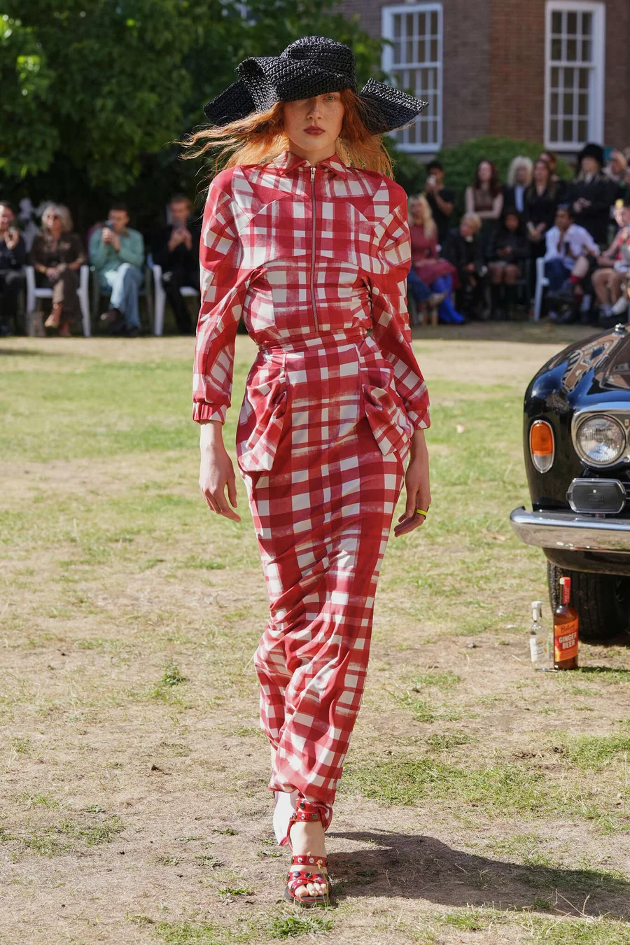
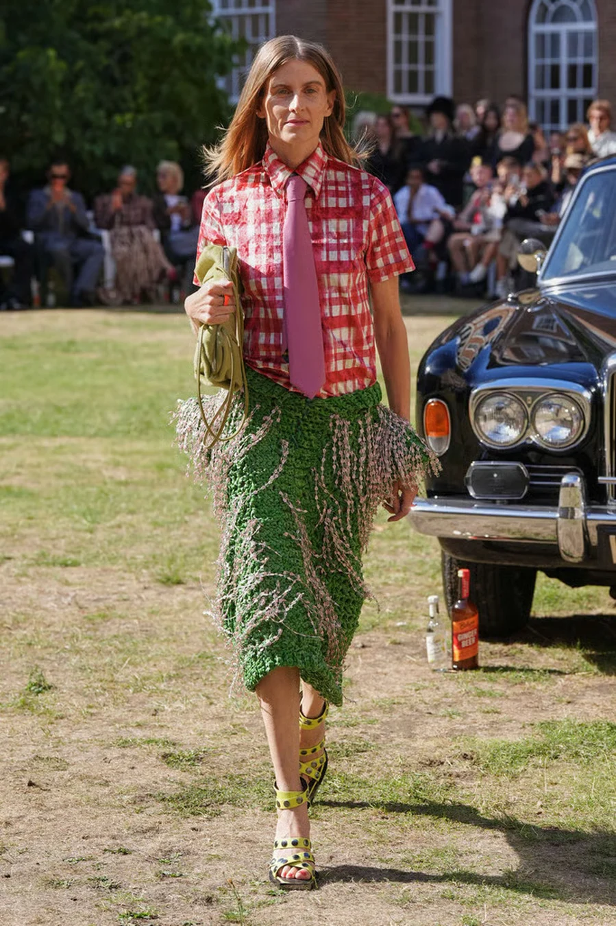
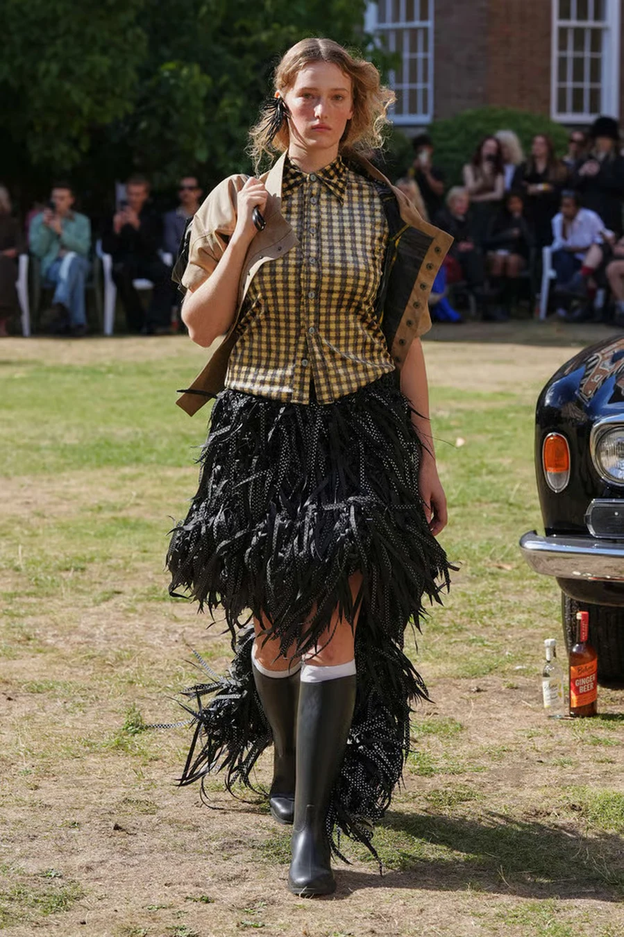
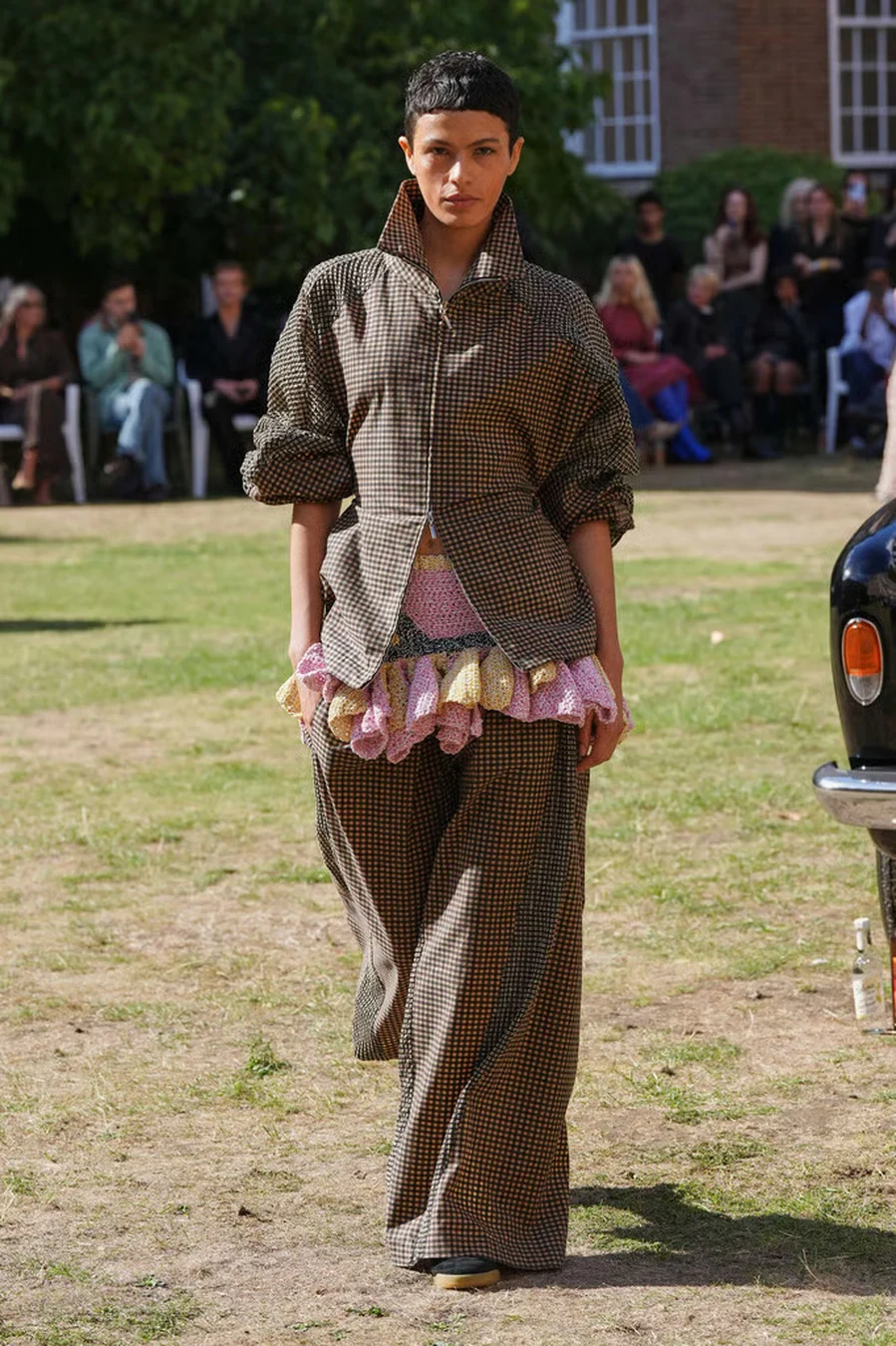
Then texture starts interfering. Across the more tactile looks, the surface grows increasingly unruly, with fringed details and raised embellishment breaking through the printed geometry. Pattern still exists underneath, but it no longer owns the entire visual field. The eye moves between colour, grid and surface, unsure which element is supposed to lead.
Raynor treats check almost like a game board that keeps changing shape mid-match. Order remains visible enough to recognise, while everything around it conspires to make the next move unpredictable.
Even rival factions apparently bring flowers.
After all that geometry, florals offer the collection a brief change in rhythm. Printed chiffon turns the flowers almost weightless, allowing them to hover over the body as light slips through the surface. The transparency gives spring a hazier, more fragile character, as though the blooms have already begun to fade at the edges.
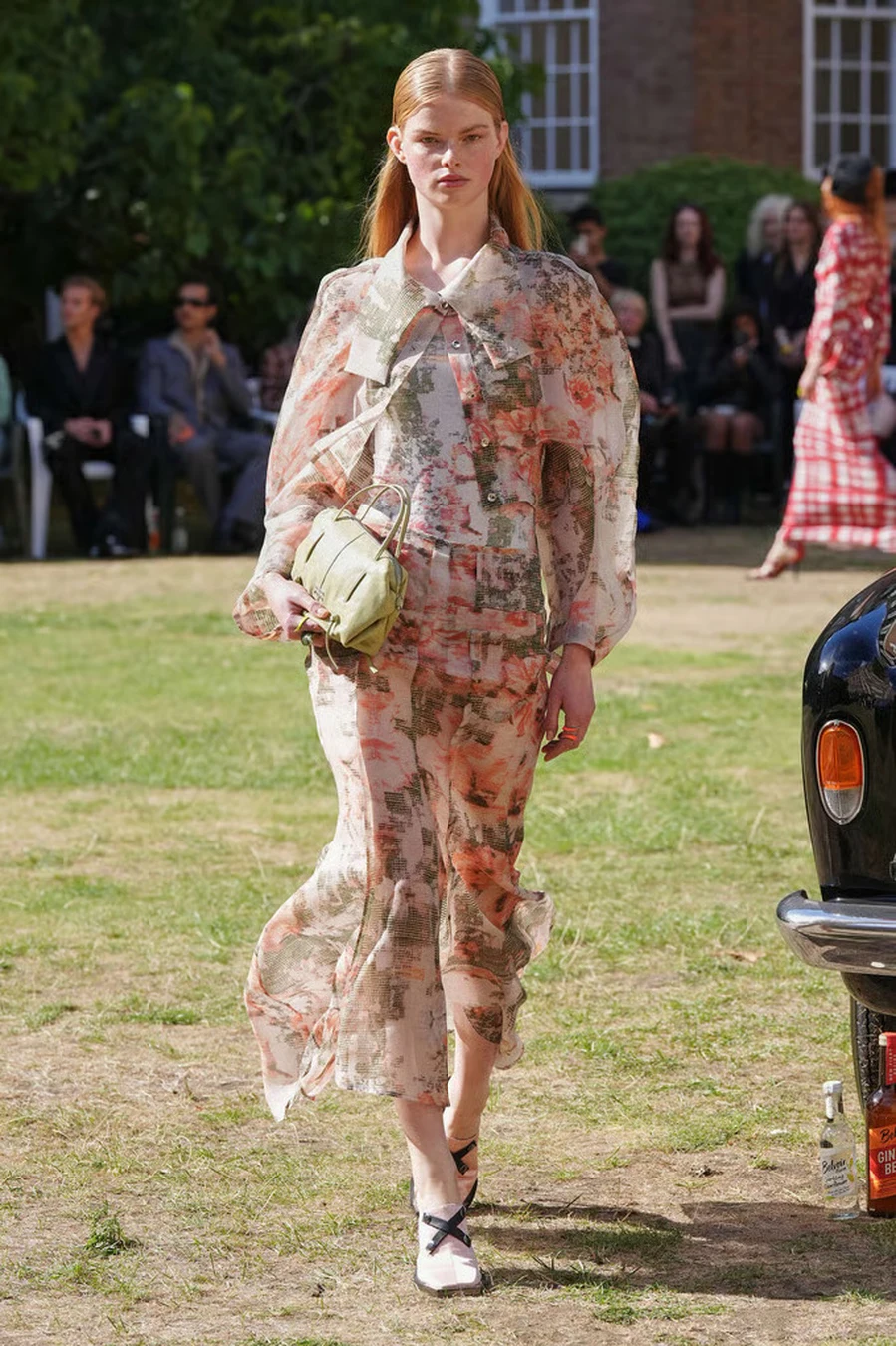
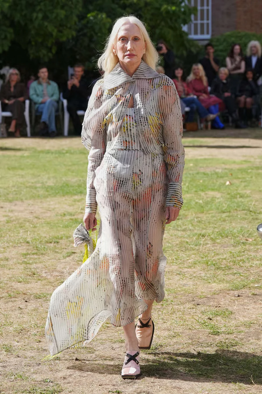
Transparency and movement keep them from becoming conventional garden dresses. Print seems to hover through the fabric instead of sitting heavily on its surface, giving the body more air and allowing the silhouette to loosen after the stricter rhythm of the checks.
It reads almost like a pause between rounds.
A floral truce, perhaps, before the texture starts fighting back.
By the later looks, the surface becomes impossible to ignore.
Openwork construction creates a new relationship with the body, leaving small pockets of space between skin and garment while still holding enough structure to shape the silhouette. Crochet and knitted surfaces bring a handmade tactility into the collection, their irregularity sitting comfortably inside Raynor’s broader preference for clothes that resist looking overly polished.
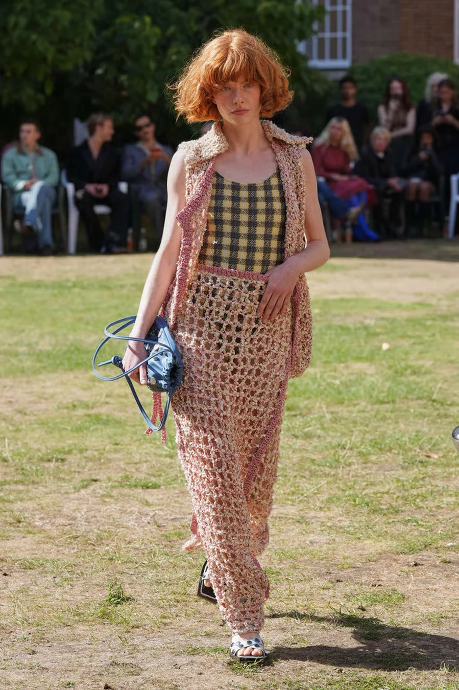
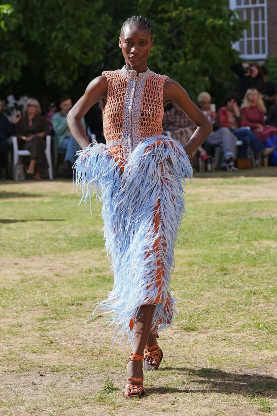
Fringe pushes that idea into motion. At first, it behaves as an accent, disturbing an otherwise controlled silhouette with a little movement around the body. Then it grows more insistent, extending farther from the garment until the outline begins to blur every time the wearer walks. What had been surface visual started determining the entire rhythm of the look.
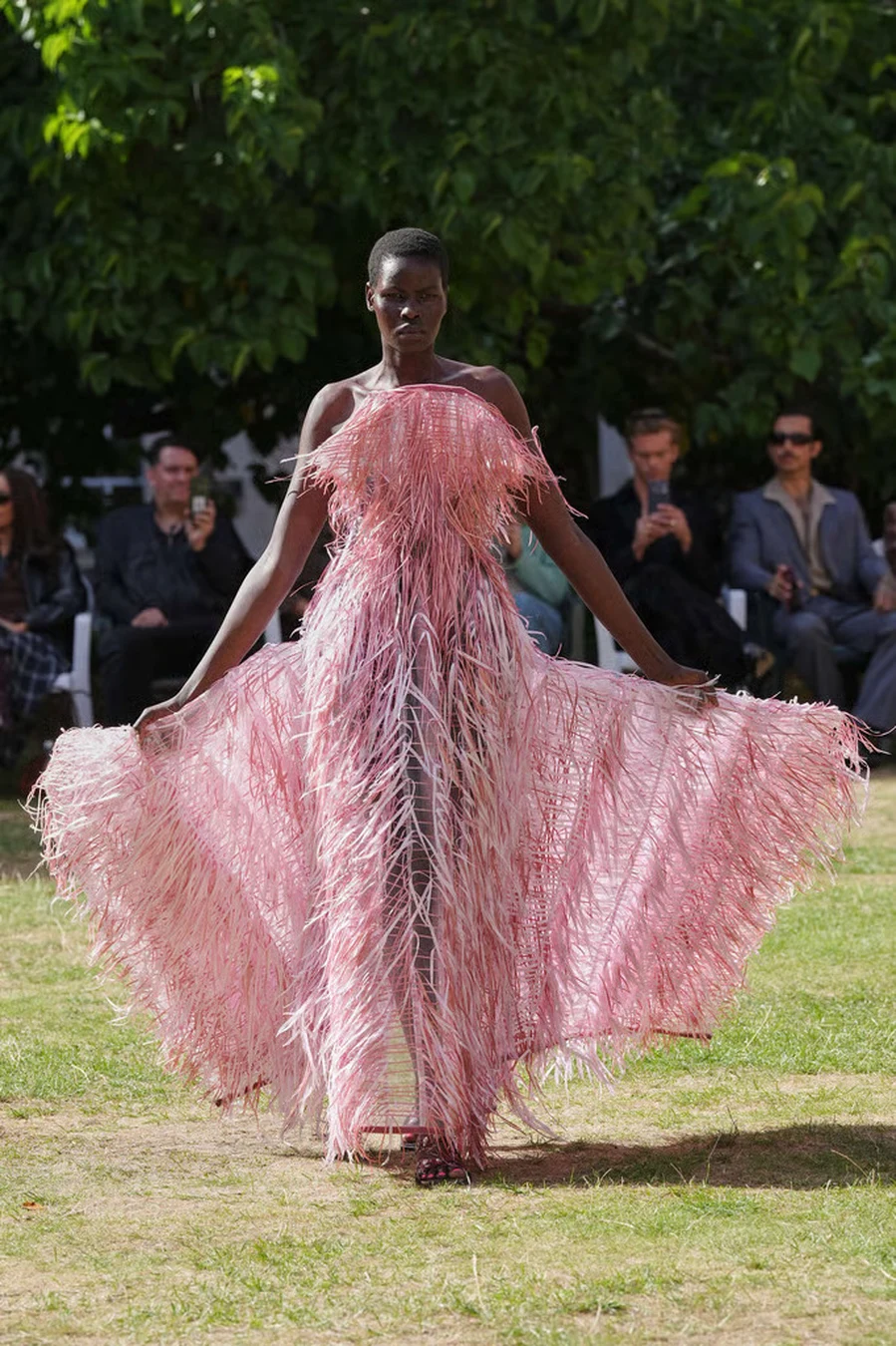
The most exaggerated fringed pieces almost erase the distinction between garment and movement. Colour remains present, construction remains underneath, but the eye catches motion first. In the pink closing gown, the effect expands across the body until the dress seems to keep moving a fraction of a second after the model has already taken her next step.
It is a fitting final move for a collection that began with the certainty of a grid.
The checks establish the board. Fringe knocks the pieces over.
For all the theatricality surrounding The Gingers vs. The Elders, Maximilian Raynor never treats world-building around clothes. The village rivalry gives him permission to exaggerate, to let British references become stranger, and to turn the runway into a place where humour can sit comfortably beside serious craft.
An emerging label does not have to choose between wit and technique, or between storytelling and clothes people remember once the spectacle has cleared. Raynor keeps letting those things collide until the collision itself becomes part of the identity.
Someone may have won on the village green that afternoon. It hardly matters now.
By the final look, Maximilian Raynor SS27 has already changed the rules of the game.
Advertisement