MENU
Close





Color does far more than establish mood. In architecture, it can alter how large, narrow, tall, deep, open, or enclosed a room appears. Understanding colors in interior design therefore means understanding space itself.
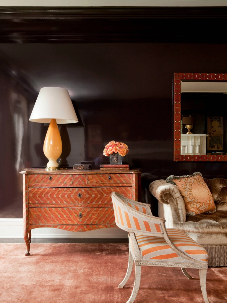
Color does far more than establish mood. In architecture, it can alter how large, narrow, tall, deep, open, or enclosed a room appears. Understanding colors in interior design therefore means understanding space itself.
September 14, 2026


The principle has deep roots in color and architectural theory. Josef Albers demonstrated in Interaction of Color that color is always relational: the same hue can appear lighter, darker, warmer, cooler, larger, or smaller depending on its surroundings. Francis D. K. Ching’s Architecture: Form, Space, & Order approaches interiors through planes, boundaries, scale, and enclosure. Together, these ideas explain why paint can behave almost like an architectural material.
Three factors have the greatest influence on perceived volume: color temperature, value or light reflectance value, and the placement of contrast.
The human eye does not simply register a painted wall as a flat field of pigment. It interprets the relationship between that wall, surrounding planes, light levels, shadows, trim, ceilings, and furniture.
This means two rooms with identical measurements can produce radically different impressions. The architecture has remained unchanged. The visual volume has not.
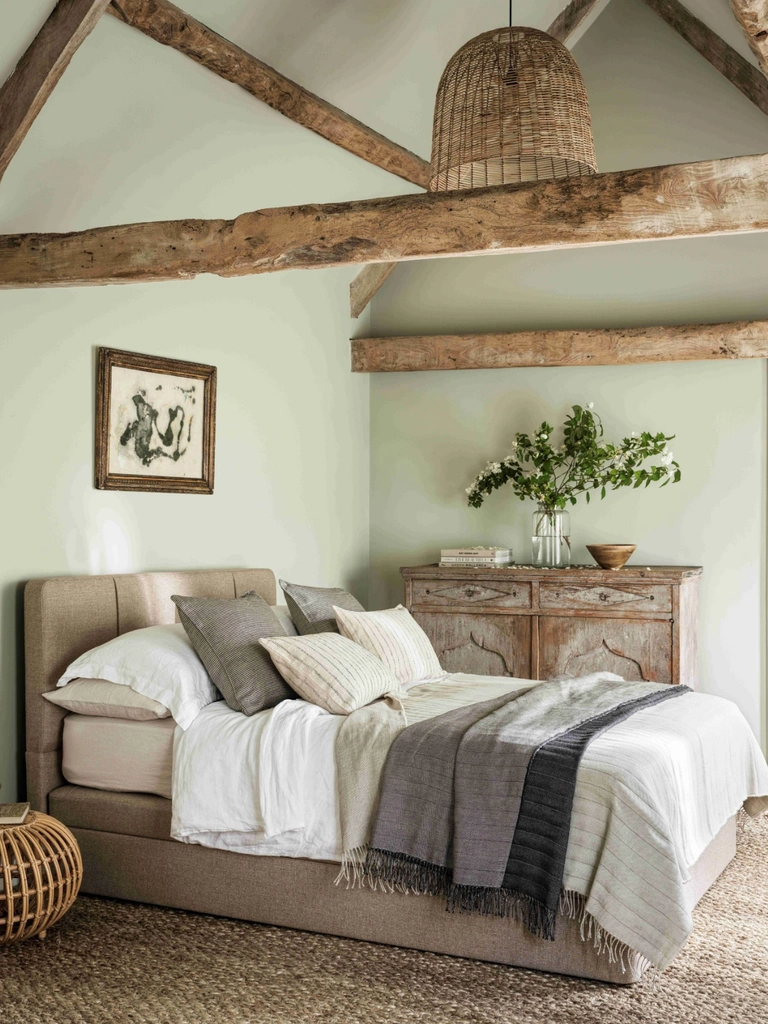
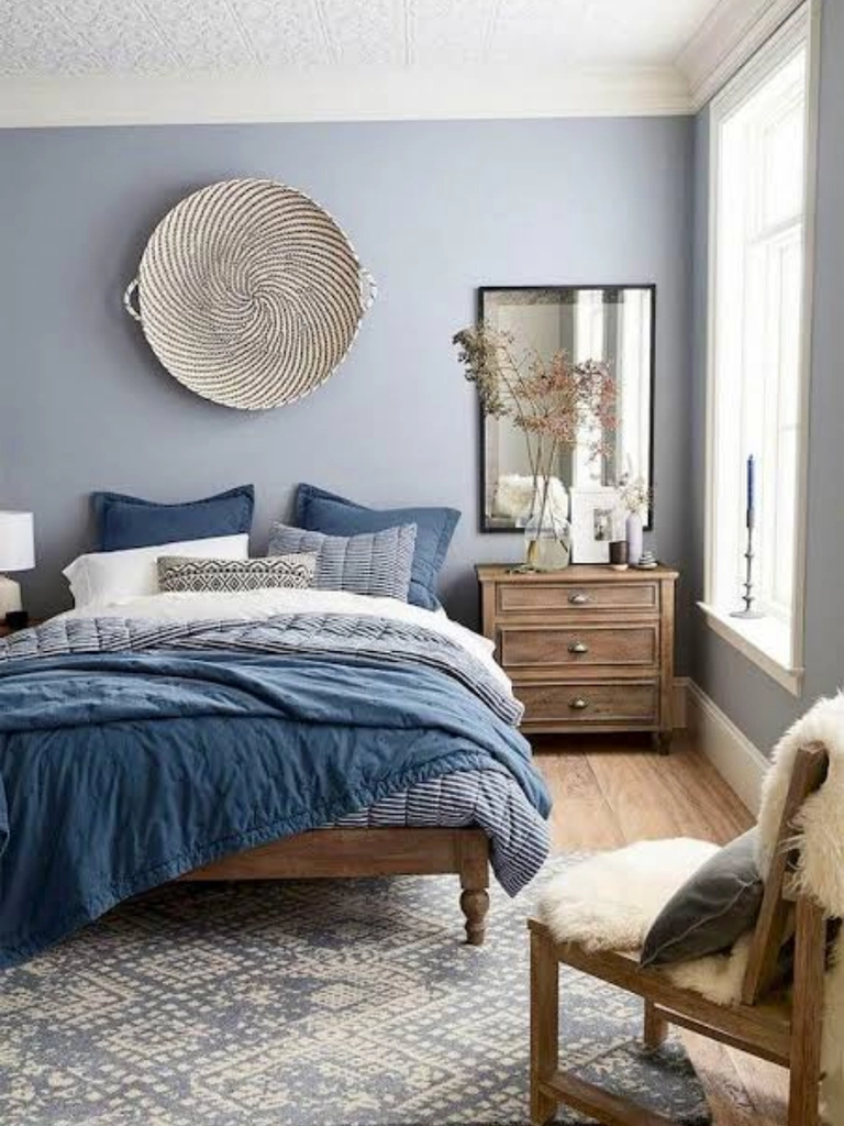
Airy neutrals, light lues, muted greens, blue-grays, and other cool colors are traditionally described as receding hues, meaning the visual relationship between cooler hues, light, and surrounding colors can encourage the eye to perceive the surface as more distant.
That makes cool tones especially useful in narrow rooms, compact bedrooms, small home offices, and spaces where the far wall feels visually close. Imagine a narrow hallway painted with a soft sage or hazy blue at its end. The cooler surface can help increase the sensation of depth, especially when surrounding colors remain relatively harmonious.
Warm colors behave differently.
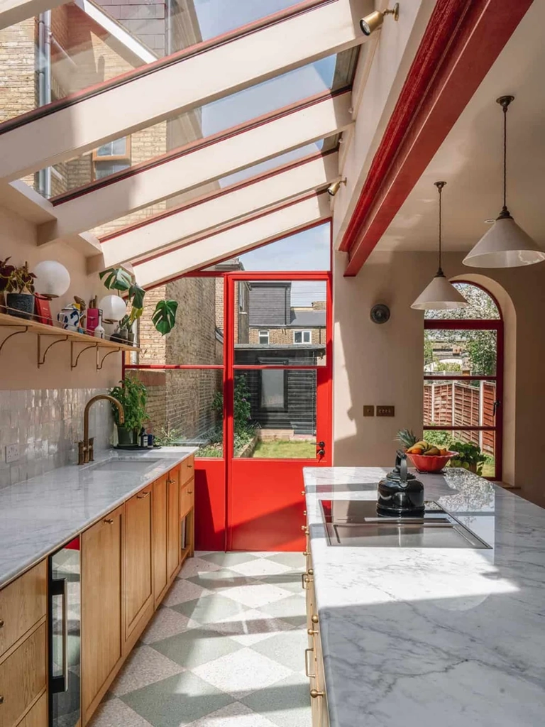
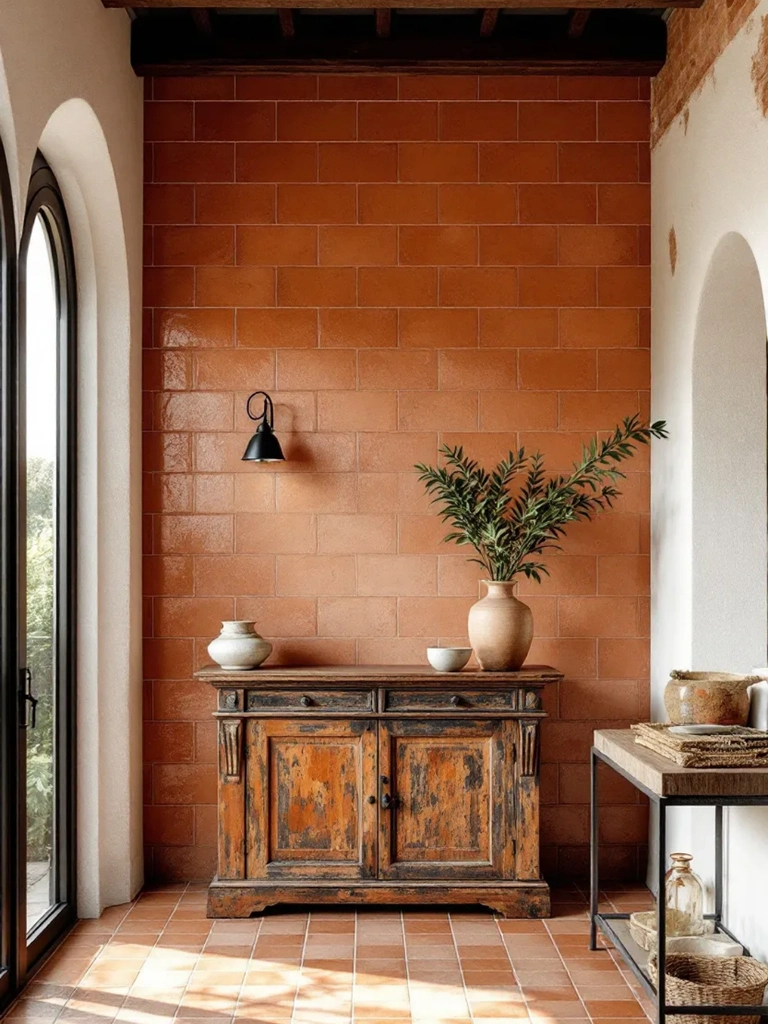
Terracotta, rust, burgundy, ochre, and saturated reds often appear more visually immediate. Designers sometimes call these advancing colors because they can give surfaces a greater presence.
A long hallway room, for example, may feel more balanced when the distant end wall is painted in a rich warm color. The surface appears visually stronger, reducing the sensation of an endlessly stretching room.
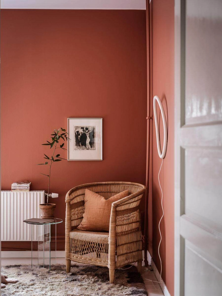
When selecting colors in interior design, temperature can therefore become a tool for controlling perceived distance.
One of the most practical measurements in interior color planning is Light Reflectance Value, usually abbreviated as LRV.
LRV describes approximately how much visible light a surface reflects. The scale generally runs from 0 to 100. Very dark colors sit near the bottom of the scale and absorb much of the available light, while pale colors sit higher and reflect significantly more.
High-LRV paint can distribute daylight and artificial light across a room, helping surfaces appear brighter and visually lighter.
This explains the enduring usefulness of pale creams, soft greens, misty blues, warm whites, and gentle grays in smaller rooms. They increase the amount of reflected light moving between surfaces.
Yet high LRV alone does not automatically make a room appear larger. A bright white room with black window frames, dark baseboards, contrasting doors, and a sharply defined ceiling line may still communicate its exact boundaries very clearly. The eye can immediately locate where every plane starts and stops.
This is where color becomes more interesting than the simple rule of “light colors make rooms bigger.”
Dark colors in interior design have traditionally been associated with intimacy, enclosure, and smaller rooms. That remains useful, yet it tells only half the story.
Deep paint absorbs more light and gives surfaces greater visual weight. This can make large living rooms, libraries, dining rooms, and bedrooms feel more concentrated and atmospheric.
A dark burgundy or chocolate ceiling, for example, can visually lower a very tall room and bring the architecture closer to human scale.
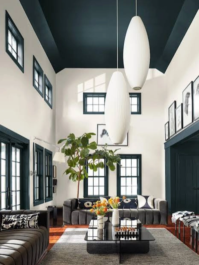
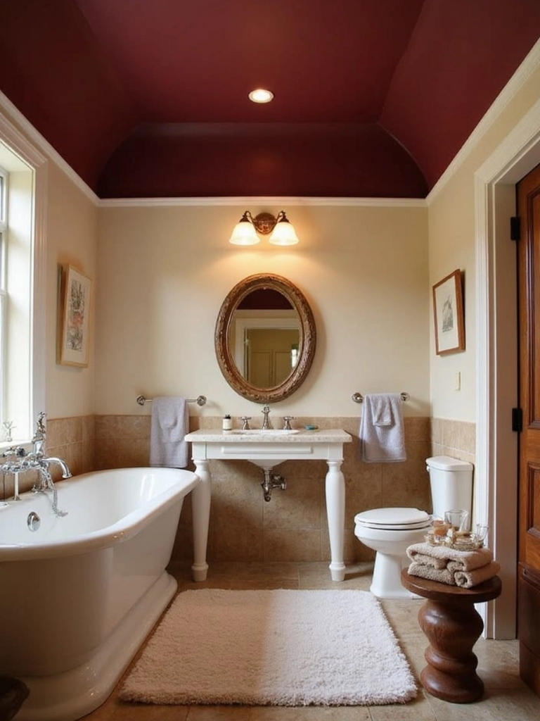
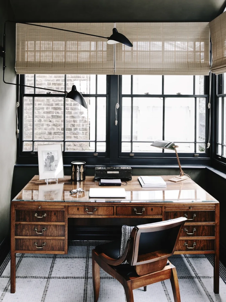
Yet dark paint can also create spatial ambiguity. If walls, doors, trim, shelving, and ceilings are painted in the same deep shade, the eye loses many of the contrast lines normally used to measure a room. Corners and door frames disappear into the wall. The exact location of the ceiling edge becomes less obvious.
The room may feel intimate while its boundaries simultaneously appear less rigid. This apparent contradiction explains much of the appeal of contemporary color drenching.
Color drenching involves extending one color across almost every architectural surface. Walls, skirting boards, doors, radiators, built-in shelving, window frames, cornices, and sometimes ceilings are covered in the same hue or a very closely related shade.
The technique removes many of the conventional white lines that normally outline architecture. In small powder rooms and snugs, color drenching can make corners feel less restrictive because the transition from one plane to another becomes subtle. In larger rooms, the same technique creates drama and cohesion.
Finish also changes the effect.
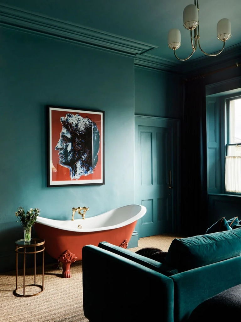
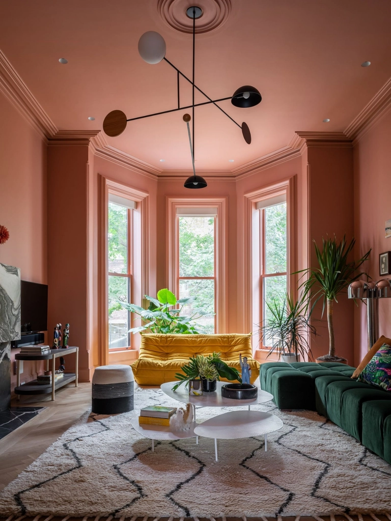
Matte and chalky surfaces scatter light softly, helping transitions between planes remain quiet. Gloss creates stronger highlights and can emphasize molding, paneling, and architectural texture.
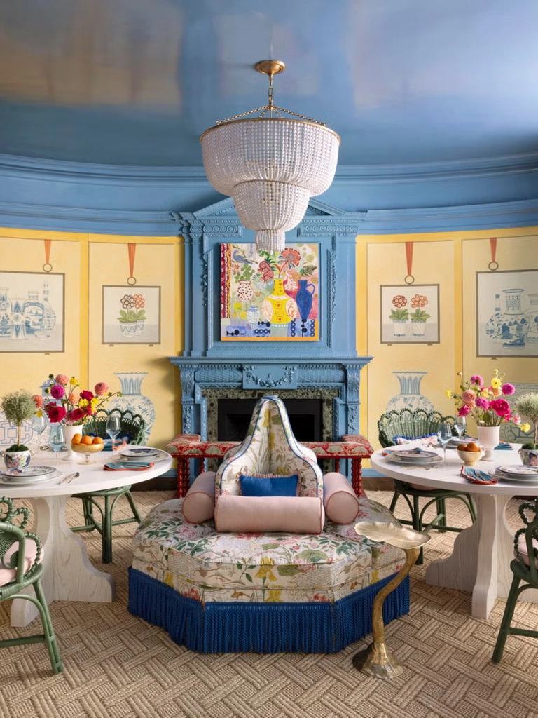
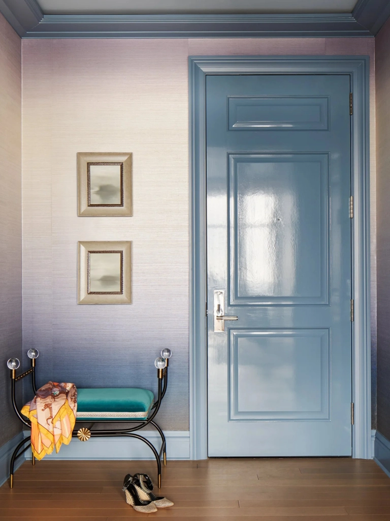
Color drenching therefore depends on both hue and surface treatment.
A newer interpretation is double drenching, where related shades from the same color family are used across different surfaces. Walls might be forest green, woodwork deep olive, and the ceiling a slightly different saturated green.
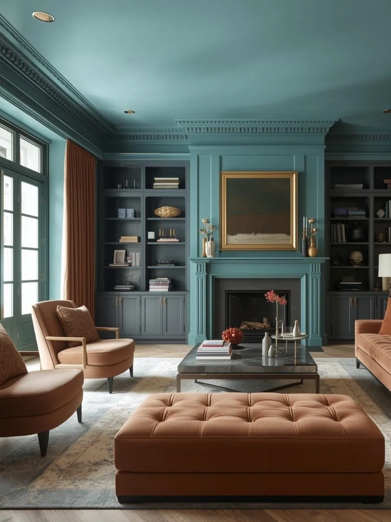
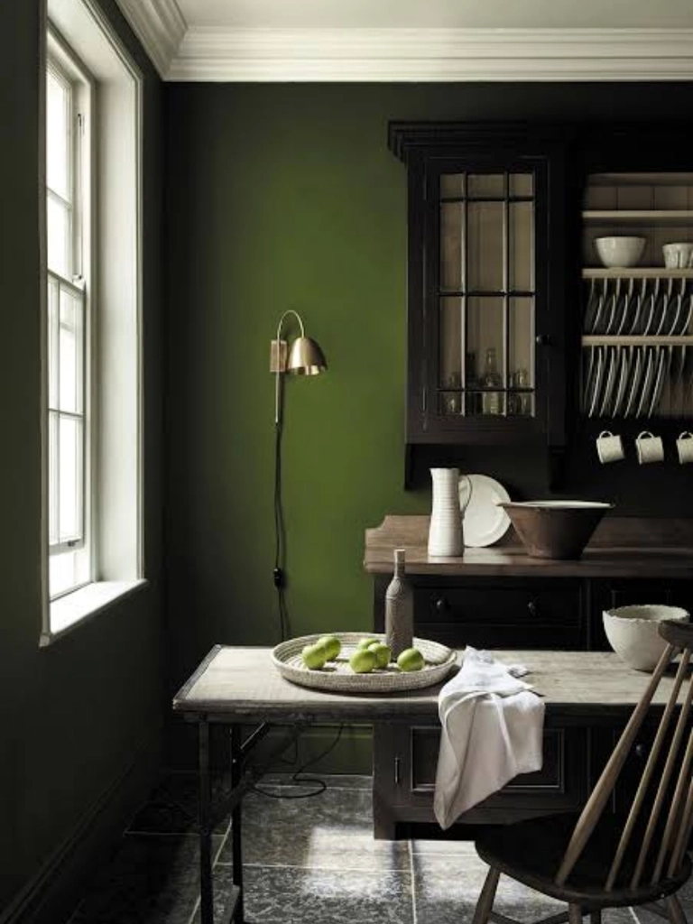
This approach allows architectural details to remain visible while avoiding the abrupt contrast of green walls against brilliant white trim. The eye still recognizes changes in architectural depth, yet those transitions remain connected.
Double drenching is particularly useful in rooms containing paneling, built-in shelves, elaborate moldings, or multiple door frames. One completely uniform shade may flatten some of those details. Related colors restore dimension without breaking the spatial flow.
The ceiling is often the most ignored plane when selecting colors in interior design.
Many interiors automatically default to white overhead, even when every other surface has been carefully considered. Yet the ceiling occupies a huge area of uninterrupted visual space and has enormous influence over perceived height.
Dark ceilings tend to appear more substantial. In a loft or room with unusually high ceilings, a deep shade can visually bring the ceiling closer and make the environment more intimate.
Another strategy is ceiling wrapping.
Instead of stopping wall color precisely at the ceiling line, the color continues approximately 12 to 18 inches onto the ceiling. This creates a new visual boundary slightly inside the ceiling plane. The room can then appear lower, warmer, and more enclosed.
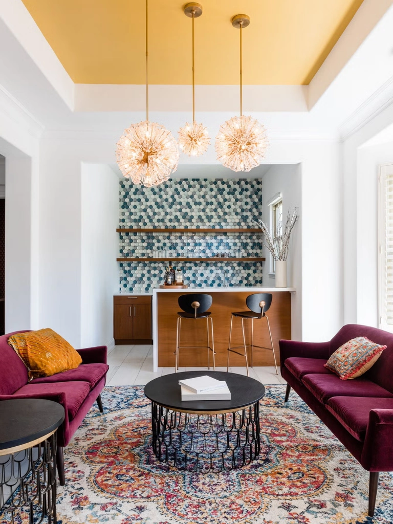
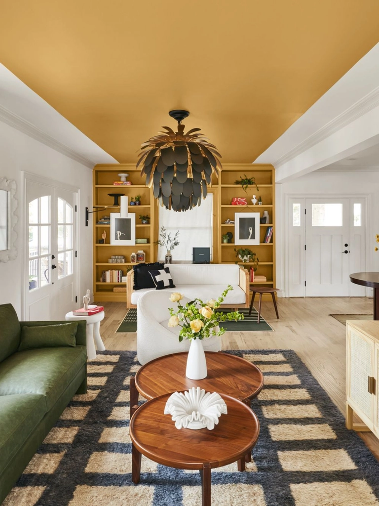
The opposite approach works well for low ceilings. Keeping the upper walls and ceiling relatively close in value reduces the strength of their junction, allowing the eye to travel upward more continuously. The so-called fifth wall can therefore control vertical volume just as effectively as the four surrounding walls.
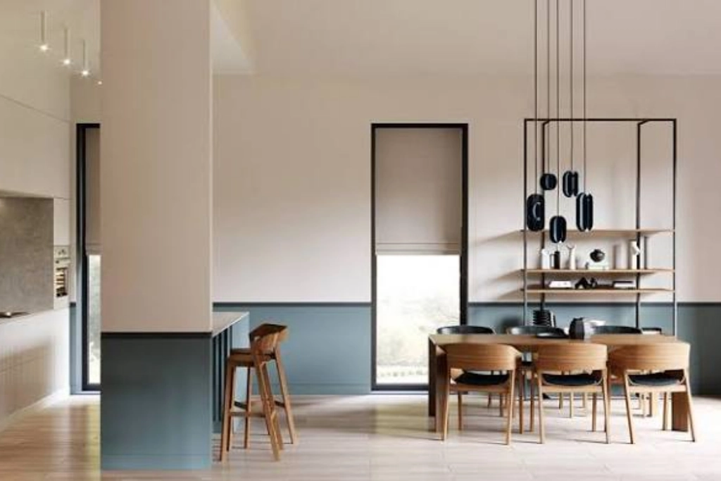
Horizontal color blocking changes the perceived proportions of a wall by introducing a new visual horizon.
One common approach places a darker shade across the bottom third of a wall and a lighter shade above. The darker lower band visually anchors furniture and creates a grounded base. The lighter upper section encourages the eye to travel upward. Paint can therefore redraw proportion without changing a single architectural element.
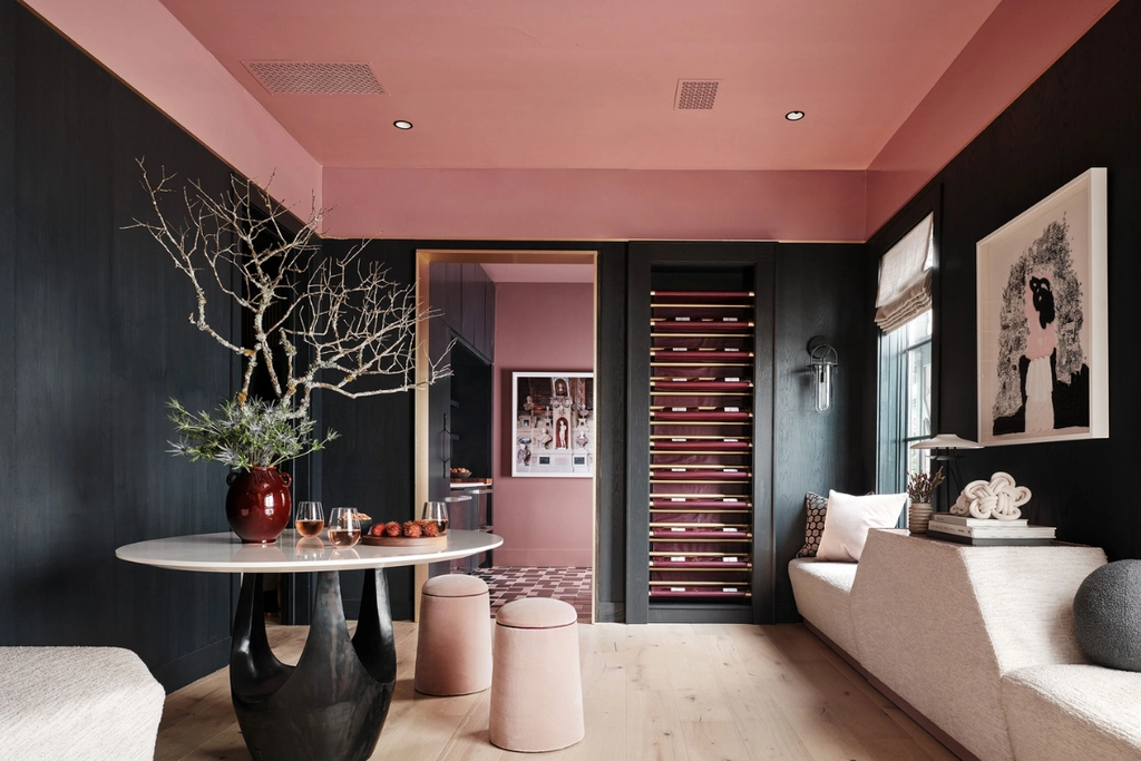
No discussion of colors in interior design is complete without considering light. Paint cannot be separated from the illumination falling on it.
A high-LRV color can reflect large amounts of daylight in a bright room, yet the same paint may appear muted in a poorly lit space. A cool gray can look clean and airy under certain daylight conditions and noticeably heavier elsewhere.
Natural light also changes throughout the day.
Morning light, direct afternoon sun, cloudy skies, north-facing exposure, and sunset all modify temperature and intensity. Artificial lighting adds another layer. Warm bulbs can strengthen reds, creams, browns, and ochres. Cooler lighting may sharpen blues and greens. Glossy finishes create stronger highlights, while matte paint produces softer transitions.
For this reason, paint should always be sampled directly in the room and examined at several times of day.
The most effective use of colors in interior design starts with a spatial question before it starts with a decorative one.
Does the room feel too narrow? A cool receding hue on the distant wall may introduce depth.
Does an enormous ceiling make the space feel impersonal? A darker overhead color can bring the volume closer.
Does a small room contain too many doors, moldings, and visual interruptions? Color drenching can quiet those edges.
Does a low room need additional vertical movement? A lighter upper wall and low-contrast ceiling junction can help guide the eye upward.
Temperature influences apparent depth. LRV changes the way surfaces interact with light. Contrast determines where the eye locates architectural boundaries. Once these three variables work together, color becomes far more than finishing decoration. It becomes a method of editing space itself, allowing a room to appear deeper, wider, taller, softer, or more intimate without changing its physical dimensions.